ADSB status & sensor hysteresis questions

jdubner

Member
Joined
Apr 30, 2006
Messages
148
Location
Independence, OR
Dynon support: please answer these two unrelated questions.  I've searched the documentation, honest <g>.

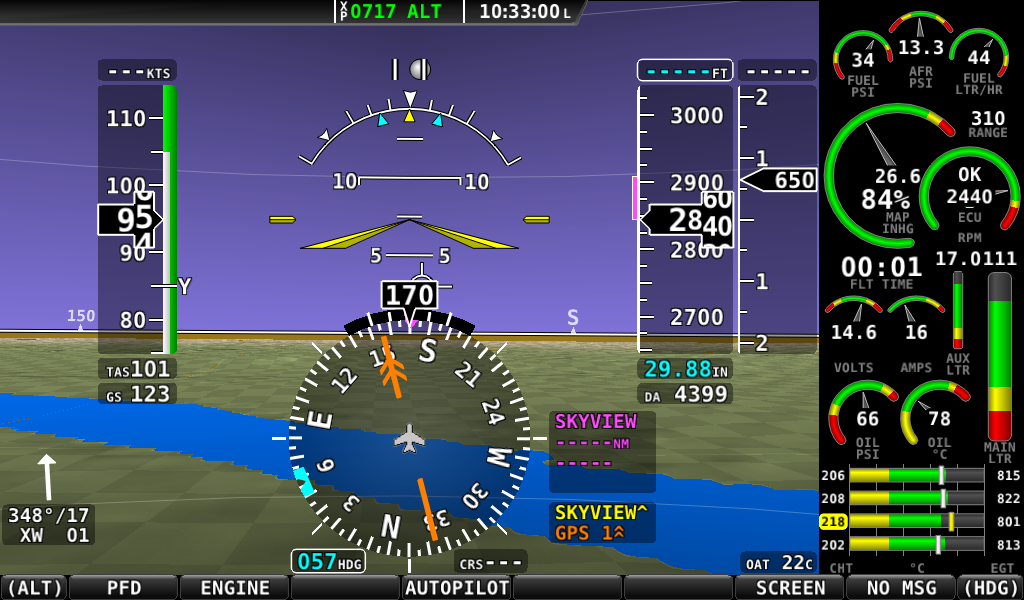
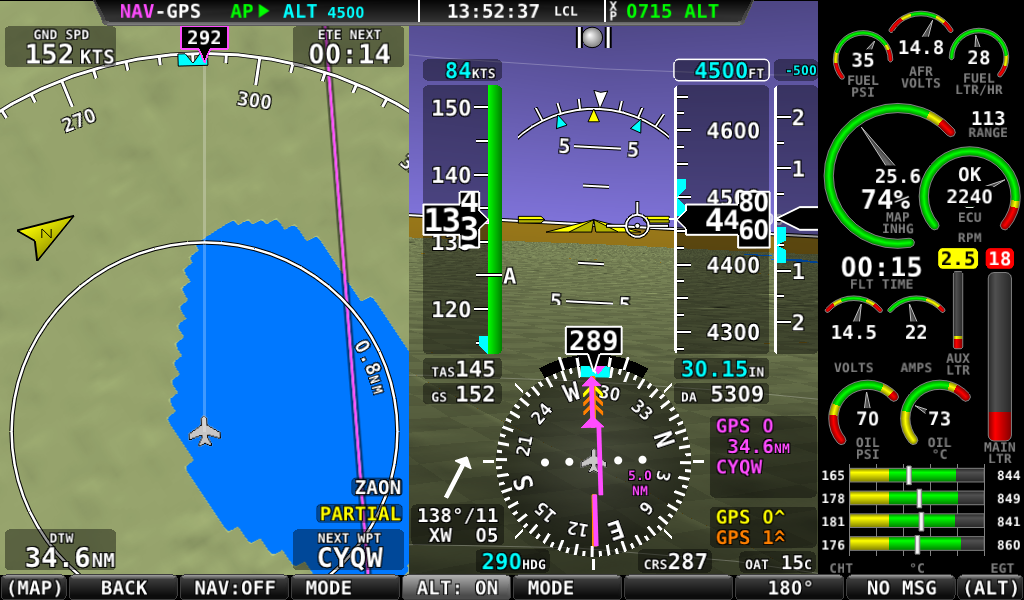
Is it possible to disable the translucent "ADS-B Status" display in the lower left?  I'd like to reclaim some of the map screen and would be content with a small colored icon on the top (status) line rather than the detailed info (which could still appear in the Setup Menu, for example).

Can I have some hysteresis in the alarm level of an EMS sensor?  The need is most noticeable in the fuel low level alarm where sloshing causes repeated alarm cycles.

Thanks,
Joe
 

Dynon

Dynon Staff
Staff member
Joined
Jan 14, 2013
Messages
14,232
Location
Woodinville, WA
When you have ADS-B and the weather layer is on, that widget is always there and can not be turned off.

In the engine sensor definitions file (the .sfg when you export settings) there is a way to edit the filters. See http://wiki.dynonavionics.com/Making_your_own_sensor_definitions for a guide to changing those parameters. Window, filter, and shift are the three that affect filtering. However, note that currently, these may not be obeyed properly for fuel level. Improving fuel level filtering for sloshing was actually supposed to be a change in v11 through a combination of a software change and a change to that file, but the improvement may have had a bug and so we pulled it. You can try experimenting with the values in the .sfg, but they may not do anything. Let us know what you discover if you do!
 

jdubner

Member
Joined
Apr 30, 2006
Messages
148
Location
Independence, OR
Thanks for the response.  I've decided to wait at least for the 11.1 release before attempting any experimentation with my fuel sender definitions.  Even then, I'm at a point in life where I just want to fly and may not want to expend much effort doing SkyView development work (sorry, just being honest).  However, I would like NOT to be annoyed or distracted with needless fuel alarms when intentionally running a tank dry or landing with one tank in a low fuel state.

Regarding the ADS-B widget, I'm struck by how cluttered my map screenshots are now compared to earlier ones (say, back in the 7.0 days).  The ADS-B widget, the associated lower-right status, a "north up" graphic, and other things have been added.
 
ADSB.jpg


Of course, the capabilities of the map have been expanded but I'm having difficulty using it for navigation and terrain avoidance planning when only such a small part of it is visible.  (I don't even try to use my Seattle Avionics chart subscription any longer).

This wouldn't be objectionable and maybe not even noticeable with two displays so the map could have more screen real estate.  I'll bet you test UX that way <g>.  But I can only fit a single 10-inch screen in my panel and need the 40/40/20% split.  Remember, this is all happening in an area not much larger than a 3X5" index card.

My request for a "declutter" function (http://dynonavionics.com/cgi-bin/yabb2/YaBB.pl?num=1407444060/0#0) has been met with deafening silence but I hope you'll consider it before evolving more map features.

Also consider a single ADS-B IN status entry on the top status line -- something like the transponder's.

I hope other users will chime in with support for this.  I can only imagine what this is like on a single 7-inch display.

Thanks,
Joe
 

rfinch

New Member
Joined
Jan 6, 2009
Messages
55
Location
Davis California
Not really on topic, and I have yet to buy my Skyview system (soon, very soon), let alone use one. But something caught my eye in this very busy screen, in the engine window.

It's very difficult to tell at a glance which parameters are in or out of range. Why? Because all the colors (green, yellow, red) all show very brightly, while the needles or indicators are dull gray. The fundamental problem is emulating a physical scale or dial with a backlit lighted panel.

I'd much rather see a rethinking of information presentation. Rather than emulating old methods, think of how to take advantage of the new hardware. For instance, why show yellow or red at all, if a parameter is in its correct operating range? Or if you want to show the yellow and red ranges to show the entire range, dim the colors that are not applicable. The goal is to give the pilot essential information quickly: the engine is operating normally in all parameters.
 

TRCsmith

Member
Joined
Oct 24, 2006
Messages
258
Location
Suisun City, CA
Not really on topic, and I have yet to buy my Skyview system (soon, very soon), let alone use one. But something caught my eye in this very busy screen, in the engine window.

It's very difficult to tell at a glance which parameters are in or out of range. Why? Because all the colors (green, yellow, red) all show very brightly, while the needles or indicators are dull gray. The fundamental problem is emulating a physical scale or dial with a backlit lighted panel.

I'd much rather see a rethinking of information presentation. Rather than emulating old methods, think of how to take advantage of the new hardware. For instance, why show yellow or red at all, if a parameter is in its correct operating range? Or if you want to show the yellow and red ranges to show the entire range, dim the colors that are not applicable. The goal is to give the pilot essential information quickly: the engine is operating normally in all parameters.


Mr. rfinch

If your new to EFIS I think you need to fly one first. it's easy for me to make commits of other EFIS and I have, then the more you use them the more you can understand the colors/parameters at a glance. I've used the G1000 and Skyview.

The colors seem to be more bright in the picture than looking at an actual screen, but I do agree the dull gray could be brighter or different color.

Also you'll find after logging more time with one, the screen is less busy as you absorb and process the information faster and spend more time looking out side the plane..

You can have information over load at first then the more you fly with your EFIS you'll find information is power, and Dynon seems to find a way to give us more. ;)
 

mmarien

Murray M.
Joined
Dec 26, 2009
Messages
1,206
Location
Saskatoon SK CAN
It's very difficult to tell at a glance which parameters are in or out of range. Why? Because all the colors (green, yellow, red) all show very brightly, while the needles or indicators are dull gray. The fundamental problem is emulating a physical scale or dial with a backlit lighted panel.
I think the highlighting scheme is very effective. The screen above has too many warnings/errors indicated but the engine is not running. Check out the following and see if you can determine what needs attention.

hightemp.bmp


lowfuel.bmp
 

Eric_Greenwell

I love soaring! Flying is good, too.
Joined
May 11, 2014
Messages
102
Also consider a single ADS-B IN status entry on the top status line -- something like the transponder's.

I hope other users will chime in with support for this.  I can only imagine what this is like on a single 7-inch display.

I use a 7" display, with the map at 40% (40% PFD, 20% engine). The ADS-B widgets take up a lot of real estate, and close to the aircraft icon. I'd like them smaller, near the top of the screen, or best - on the status bar like transponder. I'm thinking of making the PFD 20%, which would help the Map.
 

rfinch

New Member
Joined
Jan 6, 2009
Messages
55
Location
Davis California
[Note to Dynon, apologies for continuing my thread hijack, feel free to move to a new thread if you wish.]

If your new to EFIS I think you need to fly one first...Also you'll find after logging more time with one, the screen is less busy as you absorb and process the information faster and spend more time looking out side the plane...You can have information over load at first then the more you fly with your EFIS you'll find information is power, and Dynon seems to find a way to give us more.
I think the highlighting scheme is very effective. The screen above has too many warnings/errors indicated but the engine is not running. Check out the following and see if you can determine what needs attention.

Yes, fair enough, and I look forward to eventually getting everything together, working, and FLYING! In the screenshots mmarien posted it certainly is clearer what needs attention.

Nevertheless, let me pursue a thought experiment, an exaggerated example of a vague idea I have for glass panel or HUD (Google Glass, et. al.) displays.

In this thought experiment, you have programmed a flight plan into your glass panel system. You've reached cruise altitude, the engine is running within parameters, plenty of fuel, and autopilot is keeping your aircraft on course. No nearby traffic, weather is VMC all around. In other words, a fine flight.

What should your panel display? In this experiment, perhaps it should display nothing, or nearly so. In other words, maybe our spiffy new technology should only alert us to anomalies, not flood us with information constantly when everything is fine.

Well, even I won't make the case to display nothing. But my point is that we can now measure and calculate far more data than with round gauges...but do we need to see all that data all the time?

Maybe not. So as others have suggested, there needs to be a way to have different amounts (levels) of data displayed. Perhaps each data item could have a level associated with it, and in initial setup the user would choose what data item gets what level.
 
Top