thibault
Member
- Joined
- Oct 25, 2009
- Messages
- 191
Is it possible to make the icon solid rather than an outline?
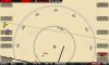
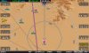
I have a hard time seeing any of the icon choices across the cockpit on a 7" display whenever the map background is light colored.
I looked at the .dfg file and found the entry "aircraft_icon_type", but that is just the choice of which icon. There does not appear to be any further definition in that file or the .sfg file, so maybe it is hard coded in firmware and not adjustable by the config files.
If it can not be changed by dfg or sfg, my vote would be a setup selection of outline or solid.
")