Whats next

jakej

Well-Known Member
Joined
Oct 10, 2007
Messages
2,121
Location
Adelaide, Australia
My preference is leaving the display options as they exist now, Portrait mode is better for the 'look ahead' IMO. I can live with the engine stuff in the vertical 20% screen, my ears will tell me if there may be a problem with the engine & it is a quick button press to get to 50% for more info ;)

Jake J
 

vlittle

Active Member
Joined
May 7, 2006
Messages
538
My preference is leaving the display options as they exist now, Portrait mode is better for the 'look ahead' IMO.  I can live with the engine stuff in the vertical 20% screen, my ears will tell me if there may be a problem with the engine & it is a quick button press to get to 50% for more info  ;)

Jake J

+1 on that.

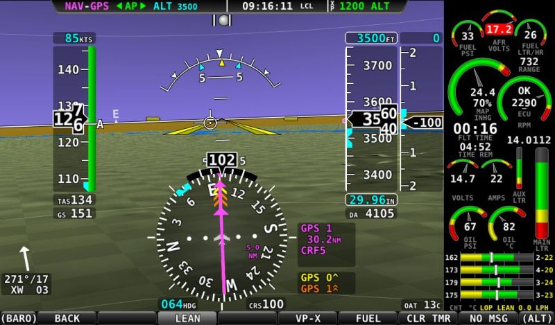
If you want to improve screen usage, I would vote for more customization of the EMS display. For example, its not always necessary to display the units-- I have a custom sensor that display BTDC timing-- but it's labelled PSI because there is no degrees widget. BTDC is fine by itself. And RPM RPM, you're redundant redundant.

Also, I would like to have the bar graph display with the numerical value directly over the units, rather than at the other end of the bar (see Oil PSI above). Finally, the choice of some smaller arcs and bars would be useful.

The net result would be to tidy up the EMS display and make it more legible. I have packed everything I need on the 20% display and there's a lot of extraneous labels. I don't find a need for the 50 or 100 percent screens because I want to get skilled at quickly locating the information on the 20% screen. Swapping screens in flight is time consuming and inconvenient.
 

cbennet12

Member
Joined
Mar 21, 2011
Messages
132
Since SkyView's screens are wider than they are taller, we always thought the space was better used with vertical strips. We're interested to hear why you would prefer to see the EMS on the bottom so we can consider this request better. What advantages do you see it having?

It requires us to do things like make the HSI smaller, and it means you have less look-ahead distance on the moving map when track up. We also have to make the info items on the side of the map smaller.

With a 7" screen, I would like to have more real estate for the PFD and moving map. That's my rational.

Rather than mimicking the entire 20% view along the bottom as you mocked up, an option could be allowing for a smaller space along the bottom that allowed for a few critical horizontal bar gadgets.

Given that this is probably a serious redesign perhaps a simpler compromise would be allowing a 45/45/10 vertical split? Or more flexibility in general for splitting the screen.

That gain may sound trivial but again, with a SV700, every little bit helps. :)

Regardless, I know of few companies that solicit input from their customers to the degree that Dynon does, it is greatly appreciated.

Craig
 

DonFromTX

I love flying!
Joined
Dec 4, 2011
Messages
282
Location
Texas
I am at a loss to explain exactly why, but I love the example of bottom of the screen EMS data.
I am guessing it is because it is different type information than the other displayed info. Some of it could also be condensed more perhaps.
 

preid

Member
Joined
Jan 22, 2010
Messages
754
Location
SoCal
I am more interested in, if you dont take the time on the layout, what would the time be used to do instead?
Knowing what lays ahead would determine how much I would ask for this, versus efforts being used for something else.
I agree about the support of Dynon. It is rare and very much appreciated!
 

dynonsupport

Dynon Technical Support
Staff member
Joined
Mar 23, 2005
Messages
13,226
We very much appreciate all your enthusiasm for our products!

As a business with thousands of customers and many competitors, we have decided not to share what we are working on too far in advance. We've found it best to only talk about stuff when it is very close to ready to ship. Making statements about software features or hardware projects in advance just leads to people taking those statements as promises that something will done, which leads to issues if Dynon's priorities need to change or delays occur.

We've been far from perfect on this in the past, but it's a lot of those mistakes we've learned from, and we're trying to be more consistent as we move forward.

We do keep track of customer requests in a formal way, and we have a list of over 1,000 things on SkyView that customers have asked for and we would love to work on given the time. The best we do is listen to all of our customers, do our best to prioritize the features, and just keep delivering awesome updates to our products a few times each year.

So, all I can really say is that it was only 34 days ago that we delivered 7.0 with airport diagrams, IFR approach plates, fuel reminders, timers, map pointer, ATC/FSS frequencies, and an improved autopilot user interface. We're hard at work on the next major software release, and it will be equally as exciting.

--Ian Jordan
  Chief Systems Architect
  Dynon Avionics
 

DonFromTX

I love flying!
Joined
Dec 4, 2011
Messages
282
Location
Texas
"The best we do is listen to all of our customers, do our best to prioritize the features, and just keep delivering awesome updates to our products a few times each year."
And that statement you made is why we just love Dynon products and the company. Keep up the good work!
 

mmarien

Murray M.
Joined
Dec 26, 2009
Messages
1,206
Location
Saskatoon SK CAN
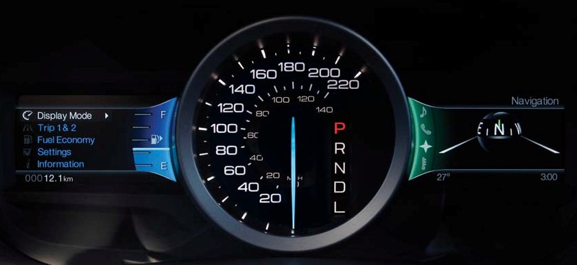
I really like the fuel and temperature gauges on the new Fords. The effect could be used on some of the EMS gauges. I don't need to see the yellow and red portions on the bottom on the current fuel gauge all the time. If it looked like the ford gauge and turned yellow and red when it got low would be cool.

fordfuel.jpg


I pack a lot on the 20% screen by hand coding but I like bigger gauges for the important stuff. How about swappable versions of the 20% screen. On climbout I tend to watch the temperatures, while in cruise it's more the fuel burn.

And as mentioned above some names are redundant. But removing the RPM or AMPS leaves a big gap in the gauge.

LOP.jpg
 
F

Fitz

Guest
What I would like is the opportunity to place engine RPM on the map page as an option similar to displaying ground speed or GPS altitude.  With the alert system in SkyView I do not need to see all the other engine parameters most of the time.  I have not been able to fly with 7.0 yet (out of the country) so not sure if that could also be put on approach plates.  In closing Dynon is a fantastic company and customer support is second to none, keep up the great work :)
 

dynonsupport

Dynon Technical Support
Staff member
Joined
Mar 23, 2005
Messages
13,226
The 17.2 in that image is not volts, it's AFR (air-fuel ratio). He's made a custom sensor to do AFR in his plane, and because of the way SkyView works it leaves volts on there.
 

swatson999

Well-Known Member
Joined
Oct 6, 2010
Messages
1,534
What I would like is the opportunity to place engine RPM on the map page as an option similar to displaying ground speed or GPS altitude.  With the alert system in SkyView I do not need to see all the other engine parameters most of the time.  I have not been able to fly with 7.0 yet (out of the country) so not sure if that could also be put on approach plates.  In closing Dynon is a fantastic company and customer support is second to none, keep up the great work :)

For CS props, I'd rather see MAP if this were an option...or better yet, both :)

But now you're starting to talk about adding all sorts of engine data to a PFD (doesn't AFS do this? I thought I saw a pic where they do)...
 

DonFromTX

I love flying!
Joined
Dec 4, 2011
Messages
282
Location
Texas
The 17.2 in that image is not volts, it's AFR (air-fuel ratio). He's made a custom sensor to do AFR in his plane, and because of the way SkyView works it leaves volts on there.
OK, got my attention now, I have an O2 sensor on my engine and was wondering how I could display it.  I don't care what Dynon calls it as long as I know what it is.
Is changing it to read AF ratio difficult?
ADDED: Now I see the AFR in addition to volts, DUH!
 

mmarien

Murray M.
Joined
Dec 26, 2009
Messages
1,206
Location
Saskatoon SK CAN
Wow, why are your volts at 17.2?
Both right. It's Air Fuel ratio (AFR). I changed it to pressure because of the way the log file works so it now it shows PSI. That's another feature requested. It would be nice to be able to create a function besides the volts/amps/pressure/level etc. or at least be able to rename one.

Code:
; my sensor definition for the oxygen sensor.
sensor={
     id=AIR FUEL RATIO
     function=PRESSURE<AFR>
     pins=C37_P8 C37_P22 C37_P31
     name=AFR
Leaving the name off gauges that are obvious works but leaves the gap. Perhaps a way to suppress the function would solve the space and redundancy problems. with the added benefit of not having AFR VOLTS or BTDC PSI.

Looking forward to the next release. There usually always a nice surprise.
 

rogersmart

Member
Joined
Aug 4, 2008
Messages
107
What's next, I'd like to see a simple second screen solution for the back seat of an RV-8. I know Dynon does not have wifi, Bluetooth and the RJ45 is not for real time data delivery. But some type of connection to a tablet to clone the screen would be a great addition to Skyview. We don't have to have 2 way communication just a screen to let the back seat dudette see what's going on.
Of course your d2 does send some data wirelessly to third party software so I bet you smart guys figure a way to do the same for skyview. (not everything has to pass a business case does it?)
 

dynonsupport

Dynon Technical Support
Staff member
Joined
Mar 23, 2005
Messages
13,226
(not everything has to pass a business case does it?)

If we're going to run this place like a charity, we're going to expect some pretty healthy donations from you guys! ;)
 

vlittle

Active Member
Joined
May 7, 2006
Messages
538
(not everything has to pass a business case does it?)

If we're going to run this place like a charity, we're going to expect some pretty healthy donations from you guys! ;)

...Since you brought it up....  We in the ROW (rest of world, i.e. not USA) don't get a free NAV database that's provided by Dynon... but we still have to pay the $500 map license AND buy a Jeppesen or Pocket FMS subscription.

The 30 hour trial period is kind of useless when outside of the USA.

So, the $500 fee is a charity donation!

Why not negotiate with Jeppesen or Pocket FMS to provide a free trial subscription certificate for non-US Map licensees?  Then we can evaluate the map software and the two database providers before making a purchase decision.

BTW, I can buy a Garmin Aera with Jeppesen database for cheaper than a Dynon map certificate and a Jeppesen database!

Vern
 

aerofurb

Member
Joined
Mar 31, 2011
Messages
76
I'm not entirely sure that the way the 'Rest of The World' operate, or the fact that we choose to live here is the fault of Dynon.... ;)
 

vlittle

Active Member
Joined
May 7, 2006
Messages
538
I'm not entirely sure that the way the 'Rest of The World' operate, or the fact that we choose to live here is the fault of Dynon....  ;)

I'm just saying... if Jeppesen and PocketFMS want to compete for my business, they should offer free trials on the SV system. Dynon could broker this, I'm sure. Just offer a free evaluation period.

Of course it's their fault. Just like everything that goes wrong within my family is my fault, according to my wife.
 
Top